Beta feedback thread

The Maparoni iOS beta is out in the wild. If you’ve given it a shot we are curious to hear your feedback.

We are thinking of it more as a late alpha as the eventual feature set for the first public release of the app isn’t yet set in stone. So feel free to let us know what you think, what’s missing, what’s not working, you like and don’t like.

Heya! Been experimenting with the beta since some weeks.
I’d like to use the app for something unconventional.
I have several GPS devices with their own Api (.json data) and I’d like to use a shortcut to visualize data in Maparoni, I was able to do that, but when updating it doesn’t overwrite the pin if it has the same name.Would it possible to add some json friendly capabilities? To make the app retrieve coordinates and different infomartion from other fields easily.

Hi Andrew!

Cool use case. Let’s see what we can do. Are you using the load-data URL scheme to update the contents or are you adding them using one of the add-* schemes to add each entry individually?

Generally when updating data, locations (or to be more precise GeoJSON Features) aren’t overwritten if they have the same name, but rather if they have the same id which should be defined on the top level of the feature, e.g.:

{
    "type": "Feature",
    "id": "1",
    "geometry": {
        "type": "Point",
        "coordinates": [102.0, 0.5]
    },
    "properties": {
        "someField": "value"
    }
}

That way those feature won’t double up and if anything changes about them, they’ll be updated.


I’ve also been wondering how to work directly with arbitrary JSON input in Maparoni, at least to have some way to do this without having to always use Scriptable, Shortcuts or alike for some simple use cases.

I haven’t yet come up with a good way to do that, as it’d need some way to dig into the JSON to first get a list of locations, and then specify how to get the coordinate or shape as well as JSON properties that you want to visualise… Maybe some kind of jq-like syntax. Any suggestions are welcome!

1 Like

@Andrew I did experiment with this and came up with a model for importing JSON. It’ll be available in the next beta, though with a user interface for it at first and it’s instead defined in a (relative simple) .geosub JSON file.

It’s already documented here: https://maparoni.app/guide/import_and_export.html. Feedback welcome!

1 Like

This looks exactly what I am looking for! can’t wait for the next beta! Any plans on supporting credentials, basic auth and more values like with GeoJson(for example Battery % voltage% and other data)?

Great. New beta build 103 is just on its way.

It doesn’t support credentials directly yet, but you can add arbitrary HTTP headers by providing "httpHeaders": {"header1": "value1", "header2", "value2", ...} on the top level next to "url". That should work for things like API keys and basic authentication.

You can add data to each location using either:

  • "propertiesPath": "$path": if all the data is on the same level and you want to re-use the existing keys, or
  • "properties": [{"path": "$path", "key": "$key"}, {"path": "$path", "key": "$key"}, ...]: if you want to cherry-pick data or specify your own keys

I’ll add those things to the documentation, too.

1 Like

Perfect!
Would an url with authentication inside it works?
Something like:
“url” : “https://myurl.com/mycar.json?user_mail=mymail&user_token=token

Edit: Just received the beta update and trying to make my first .Geosub!

Edit2: seems to work even if the url contains the token, that’s perfect! Only thing I noticed it imports every field in a path and the pin is named Unnamed, is there a way to name it inside the Geosub? and also can I add more urls with different path to a geosub file?

Good to hear it works!

Yes, there are different ways to do this:

If the property uses title or name as the key, it’ll do that automatically.

Otherwise it’ll be displayed as the name if you specify it as a field of type “text” with the option “capitalize”. You can do that in the geosub file as follows:

{
  "url": ...,
  "config": {
    "schemas" : [
      {
        "key" : "<key to use for the name here>",
        "text-options" : [
          "capitalize"
        ],
        "type" : "text"
      }
    ]
  }
}

The same thing can also be done in the app:

  • Tap the name of the collection to edit it
  • “Add new field…”
  • “Key” => Pick the key that should be used for the name
  • “Options” => “Capitalise”

Or when you look at a location, open up “Data fields”, long tap the field to use as the name, select “New field”, “Options” => “Capitalise”.

No, that’s not possible currently. The plan is to be able to do that in the app, that it let’s you view multiple collections at the same time.

Any way of adding a Key not present in the .JSON as a name as in a Custom key? I tried to create a formula but it can’t be capitalised.

Hi there. I saw the beta on a tweet thread, and it was almost exactly what I had been looking for (with a few nice bonuses like presets and filters). Been playing with it on and off for the last couple of days.

  • Completely understandable, but just noting that an iPad mini doesn’t do very well with 7k points on a map. It only force closes/crashes when I switch to another app so perhaps it is indeed fixable? OSX beta works fine, if a little sluggishly
  • The tile change button is very tricky to tap on iOS (iPhone 11, iPad mini alike). Only works about one in five. This doesn’t seem to be affected by the number of points on the map

I have a question (two actually) about properties - the points I have are generally well distributed, but occasionally I will have multiple points at the exact same GPS location (same residence, as it turns out).

  • I cannot zoom in and separate points so as to inspect properties for the points individually. There is no way to browse properties at all in this particular usecase
  • I have colouring logic based on the age of the point (ie, red for today, orange for the last week, yellow for older). The default aggregate bubble though, is a completely different colour if multiple points aggregated within it belong to different age cohorts. Perhaps this is something that needs to be controlled with a formula? I’m not entirely sure how though

A general purpose question

  • is it possible to do overlays in a collection? ie, I have the default map tiles; and also have access to a KML with political boundaries. Is there a way to to layer the political boundary KML, and my point geojson in the same map projection? Essentially, can multiple collections be displayed at the same time on a single map; or am I wishing for a Google Earth feature too far? :slight_smile:

Thanks again for building a very useful tool. I’m not sure if I explained the issues adequately, happy to attach a screenshot to illustrate if that helps

Not sure if I understand correctly, but you can nominate a key as the title/name, by adding a field for that key with type “text” and then setting the “text option” to “capitalise”. It’ll then be used as the title.

That’s great to hear and welcome to the forum!

We’re aware of that. Having a lot of locations causes some trouble with our current naive way of just throwing all of them at the map and hoping that the built-in clustering deals with it. Alas, it doesn’t seem to be as simple as that.

Can you get to interact with it at all on the iPad? I wonder if adding a style formula that tells it display as a circle rather than a pin would speed things up as the pins seems to be the performance bottle neck currently. See that circle(Number, Color) formula.

It’s on my list to have a look at that. Might do some clustering before adding things to the map, use a heat-map like visualisation when there’s a lot and you’re zoomed out, or something like that.

If you have a sample file that you’re willing to share, feel free to mail it to adrian@maparoni.net and I’ll add it to my test suite.

Thanks for pointing that out. That’s a genuine bug. Will look into it.

Ah, yes, they’ll indeed just be clustered as one on the map. If you can find them in the list, you can get to the properties that way. Will add this to our list for how to best deal with that on the map itself.

Interesting idea. Also not sure how to fit that into the current formula logic. Would if help if bubbles can’t be clustered if they are of a different colour? Or we could add another optional parameter to the pin(Any, Color) formula where you can provide a “clustering” identifier to control that yourself.

That’s not possible yet. We’re definitely keen on exploring that down the track though as it would enable a whole new bunch of interesting use cases.

A mini first version of that is the coordinate.country formula which you can use as the style of a view. It looks up the coordinate in an internal GeoJSON with political boundaries and then displays the country shape on the map rather than the bubbles.

No worries, thanks a lot for the feedback and your interest!

Can you get to interact with it at all on the iPad? I wonder if adding a style formula that tells it display as a circle rather than a pin would speed things up as the pins seems to be the performance bottle neck currently.

Yes, it’s perfectly functional on both iPhone and iPad (even with nearly 8,000 points). Very occasional freezes of the entire UI on the iPad but not often enough to be worrying. Even cluster changes on zoom in/zoom out happen relatively quickly. iPad only crashes instantly if I switch to another application (presume iOS is trying to aggressively swap out Maparoni because it’s consuming lots of memory and the app is not ready for that state change? Just a guess)

Not sure if the circle formula will work - at the default zoom level and perhaps two zoom levels in, I see almost no pins anyway. It’s all clustered aggregation circles.

I’ll see what I can do re: producing a sample file.

Ah, yes, they’ll indeed just be clustered as one on the map. If you can find them in the list, you can get to the properties that way. Will add this to our list for how to best deal with that on the map itself.

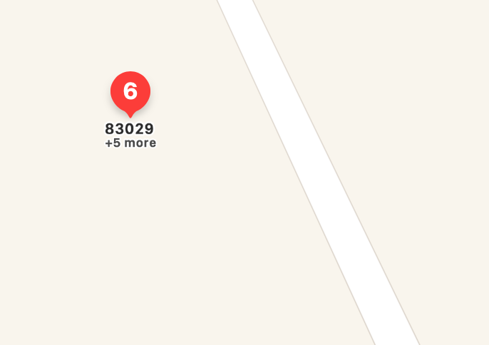
I understand this is a non-trivial UI problem, the issue is that I can’t even see which IDs are in the cluster to be able to find them on the list. See example:
image

I can see the topmost ID (83029) and I know there are 5 other points hidden in that bubble but I don’t know which they are to be able to find them on the list. Google Earth solves this by expanding an aggregated circle into a spiderweb of points on click, the points then become individually clickable.

I have colouring logic based on the age of the point (ie, red for today, orange for the last week, yellow for older).

Interesting idea. Also not sure how to fit that into the current formula logic. Would if help if bubbles can’t be clustered if they are of a different colour? Or we could add another optional parameter to the pin(Any, Color) formula where you can provide a “clustering” identifier to control that yourself.

For my specific, admittedly somewhat extreme usecase, not clustering the bubbles if they’re different colours would work quite well but I don’t know if that fits the general usage that others might expect?

I generate the geojson programmatically so I assign colours as a predefined property - this might be important information. I use Maparoni primarily to filter points by proximity and as a visualisation tool.

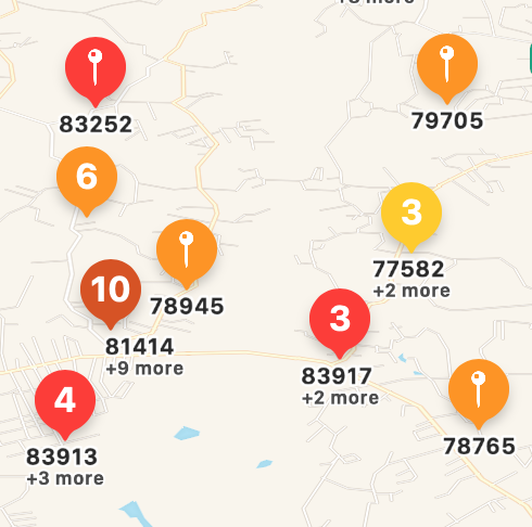
Just to note, it is actually quite brilliant when it works - see example:
image

The ochre coloured circle with 10 values is the default pin colour for this view (which indicates there are multiple age cohorts). But the yellow 3, the orange 6 and the red 3/4 bubbles seem to be clustered with the same age cohort because the colour has switched.

r we could add another optional parameter to the pin(Any, Color) formula where you can provide a “clustering” identifier to control that yourself

Not quite sure I understood this - so I create each geojson point with a custom property (which allows identification of cohort - I do this already, except I just set maparoni-pin-color). How that translates to a cluster is a bit beyond me at the moment.

A mini first version of that is the coordinate.country formula which you can use as the style of a view. It looks up the coordinate in an internal GeoJSON with political boundaries and then displays the country shape on the map rather than the bubbles.

Hmmm, actually this might work if I can switch between the two styles. Thanks!

One more question, I tried this but it didn’t seem to work. I can run a distance filter just fine from my current location (ie, distance < 10km as per the example). It is sometimes useful to be able to do this from an arbitrary point which is not my current location - like so:

distance(“lat,lng”) < 2km

I variously get “distance can only be calculated between locations”, and “distance/1 function can only by (sic) applied to location (ie, LatLng)”

yes, but I can do that only if the key is found inside the json, what if the name I wanna give my pin is not one found in the json? like a custom name?

Thanks for elaborating on the clustering issue. Definitely makes sense, and we’ll see what we can do about that. Won’t be a quick fix though.

In the shorter term, adding that pin(Any, Color, Any) formula should do the trick for your use case. Select the slidery button in the bottom left when viewing your collection, then select “Style”, and then type pin(maparoniPinLetter, maparoniPinColor, maparoniPinColor) – that way it’ll keep its pin content and colour (the first two parameters), but only pins of the same colour are clustered (the last parameter). It’ll be available in the next build (110).

Side note on “Style”: This let’s you change how each entry in the location is displayed on the map (and in the mini preview to the left of it). Say, you can display a single point location as a circle, change what should be in the bubble (“pin”), display it as a line instead, what colour it should use. It’s pretty powerful.

On filtering by distance to another location, that is possible. Say, to only show things near London, use distance(LatLong(51.5, -0.1)) < 50km. (Thanks for pointing out the typo, too.)

Ah, I see. When the collection’s content is coming from an external source such as an API or a GeoJSON hosted somewhere, then you can’t modify that content itself or add something to it. You can only add fields (including formulas) for how to interpret or visualise that content.

What I can do is change the current logic slightly so that when you add a formula field with the name “Title” or “Name” that it’ll then use that as the name for each pin, if it doesn’t have one already. Would that help?

1 Like

Exactly that’s what I meant!
Actually trying with a formula was the first thing I did, so I think that it would be the right solution :slight_smile:
Maybe adding the option to Capitalize the formula so it can be used as a title?

Edit:
Just downloaded the new beta, and it works great! Only downside is that if a collection has multiple items each pin will have the same name.
Is there any news about the option to view multiple collections at the same time?
Thanks.

You can give them different names using the formula, such as "Item #" + (index + 1).

No news yet on viewing multiple collections at once, but it’s on the list for the V1 release.

Select the slidery button in the bottom left when viewing your collection, then select “Style”, and then type pin(maparoniPinLetter, maparoniPinColor, maparoniPinColor)

I’ll dig into this further, but typing that pin command verbatim gives the error “pin/3 needs a string for the letter, a colour and a string for the Cluster ID”. [insert I have no idea what I’m doing meme]. For some reason maparoniPinLetter is not recognised as a string/text and there is, as far as I can see, no function to cast? I could be completely off base with this (and perhaps you meant putting in string literals for parameters, which I also tried).

pin/1/ and pin/2 both exhibit the same behaviour - maparoniPinLetter is not recognised as a string, and the functions are unhappy with this.

Side note on “Style”: This let’s you change how each entry in the location is displayed on the map (and in the mini preview to the left of it). Say, you can display a single point location as a circle, change what should be in the bubble (“pin”), display it as a line instead, what colour it should use. It’s pretty powerful.

Yup, lots to explore that I haven’t yet. Looking forward to it. It probably doesn’t help that I’ve only built interfaces like this with Leaflet, so I’m more accustomed to explicitly controlling how clustering works

use distance(LatLong(51.5, -0.1)) < 50km

Of course, seems obvious in hindsight - thank you. Not sure why I thought just using a string with coordinates, or bare coordinates would be sufficient

Ah, right. Good catch that happens if you have no pin letter set on any of the locations… I’ll fix that up.

For now you can do: pin(maparoniPinLetter ?? "", maparoniPinColor, maparoniPinColor) or just replace that first parameter with something else that makes sense, such as index or coordinate.flag.